

Mark Susters blog is one I’ve been reading for years and one of the very few I check daily. Being a designer by trade, I readily offer up my design critiques for free. I’ve already given Brad Feld my two cents and wanted to do the same for Mark. However Mark’s blog was less in need of critique and more in need of a complete overhaul. I bugged Mark about it (in July) and he agreed to give it a go. Having worked with Mark before on creative projects I knew this was going to take a very long time. That’s just the way it is with busy people (and free work).
You can see an archived image of Mark’s site here. Large file warning! Thats what you get when your front page is 21,000 pixels in height.
There are two major problems with Mark’s old design. The first is that it completely lacked personality. It was top blog in its category, from a technology investor, and it was using the most basic wordpress theme. The content deserved a better treatment. Something with an identity that was also modern in its implementation.
For a while I’ve been totally enthralled with the way Newsweek treats its feature magazine content online. Huge graphic headers. Really clever parallax cutaways to surface full width images. Carefully guttered content images. All legit. So I found a wordpress theme that had the right basic elements and was able to hack in what I wanted with the help of a fiverr coder. I am a huge fan of fiverr and have spent over $1,000 there in $5 increments. It’s been an invaluable extension of my skill set. I don’t code, I’ve tried, and while I am decent at hacking with html/css the intricacies of some of the more modern wordpress themes elude me. I took a chance on a Pakistani developer named Mudassar Ijaz and he’s been indispensable.
The other indispensable person was Kyle Taylor who does “platform management” (whatever that is) at Mark’s firm Upfront Ventures. On this project Kyle was Mark’s liaison and also a second pair of design eyes and hacking hands. Working with Kyle (starting in November), rather than with Mark directly we were able to get this project done in record time. Well… three months.
So with the right blog theme and structure, I could focus on the lacking personality. I had this concept of doing a pixel art illustration of an old and young Mark sitting across a table. I am no pixel artist, but that is what fiverr is for. I found a guy, Eloy, and he is awesome at pixel characters. I did a little photoshopping and came up with the follow header for Mark’s blog.
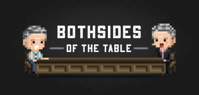
I thought this was just awesome. Humorous, light, and fits in with the tech audience. Kyle dug ’em, but Mark wasn’t too jazzed. Too… gimmicky maybe. I went a few rounds to see if there was a way we could adjust and get them in there, but it wasn’t happening. Back to both sides of the (drawing) table for this central element. Side note: I did work with Eloy on another outside-of-fiverr project that did really well. But the header was the main opportunity to inject some personality and customization. We tried a few different backgrounds of LA, but they felt too generic. Then while searching around for inspiration I came across this charcoal image of Mark, which he is using for his about.me page.
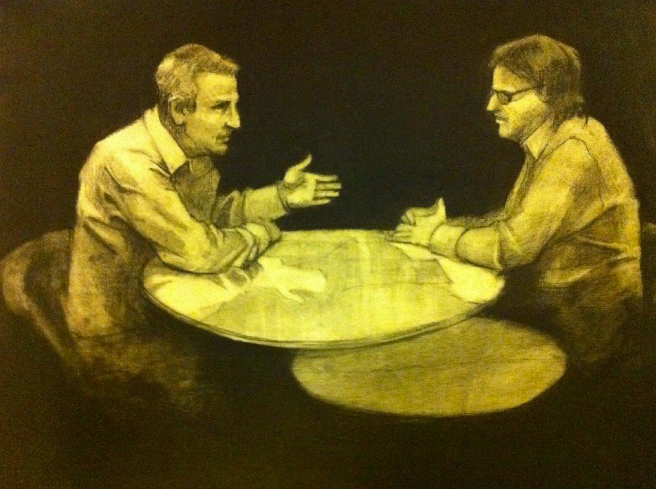
I am pretty sure the other guy is Brad Feld and this is from an episode of This Week in Venture Capital. I thought it could make a great background header but of course would require a lot of ‘charcoal-shopping’. I went back to my young and old (er.. current) Mark idea and extended the table, ‘shopped out Brad (sorry!) and added a younger Mark. It came out really well I think. Click for larger version.
I am all about details when designing, so for this ‘shop I had the younger Mark be a bit more wide-eyed (literally) and optimistic (up-turned mouth) which I think fits well with Mark’s blog and content. If you can’t tell its been manipulated (without seeing the original) then I have succeeded.
There were 101 other smaller design decisions and Kyle did a stellar job turning many of Mark’s post into really handsome works of content. The second major issue with Mark’s blog is the organization and structure is a mess. He has so much evergreen content that it just impossible to find since, as many bloggers due, he abandoned useful post tagging and categorizing early in the blogs life. But we already have a really great solution for this in place, it’s just not live yet.
The whole thing turned out really well and I think Mark’s blog is certainly the dopest VC blog on the net right now, as always in function, but now in form too!
http://www.bothsidesofthetable.com/
Edit: In case there are future design changes from my original, here is working version for posterity. http://bcoms.net/bothsides/
